Building a Professional Website Layout with CSS: Header, Navigation, and Responsive Design

Introduction
In the previous articles of this series you built a five-page HTML website from scratch, and in Mastering the Basics of CSS you learned the theory behind stylesheets. You have working pages, but they still look like a plain document from 1999: no header, no navigation bar, no branding, and nothing that adapts to a phone screen.
This article changes that. Following the Part 2 of the html-hero project step by step, I will show you how to turn those raw HTML pages into a visually consistent site with a real layout, social icons, a styled home page, and a responsive mobile menu.
You should read this article if:
- you completed the first HTML article and want to continue building the project
- you know basic CSS properties but have never applied them to a real multi-page layout
- you want to understand how header, footer, navigation bar, and responsive design actually work in practice — not just in theory
All the source code is available in the part-2 folder of the html-hero repository. Each lesson has its own subfolder (lesson-13 through lesson-19) so you can compare the result at every step.
Your First CSS File
Before building the layout, let’s quickly cover what Lesson 11 introduced at the end of Part 1: the first external CSS file.
Up to Lesson 10, all pages were unstyled HTML. Lesson 11 adds a default.css file linked from every page with a single <link> tag in the <head>:
<head>
    <meta charset="UTF-8">
    <title>HTML Hero</title>
    <link rel="stylesheet" type="text/css" href="assets/css/default.css">
</head>
This one stylesheet applies to all pages, which is exactly the right approach for a consistent site. Its base rules set the font, constrain the content width, and add basic typography:
body {
    margin: 0 auto;
    font-family: 'Helvetica Neue';
    font-size: 13px;
}

main {
    max-width: 1080px;
    margin-left: auto;
    margin-right: auto;
}
The max-width on main keeps the content readable on wide monitors while the auto margins keep it centred. This pattern is used throughout the entire project.
Publishing Your Website
Lesson 12 is about going live. The project uses Altervista, a free Italian hosting service, and FileZilla as the FTP client to upload files.
The steps are straightforward: create a free space on Altervista, switch it from the default WordPress plan to a plain hosting plan, then connect FileZilla with the FTP credentials Altervista provides, and upload all your files. This is optional — you can also follow along locally — but it is a useful exercise for understanding how websites actually get published.
Header and Footer with Semantic HTML
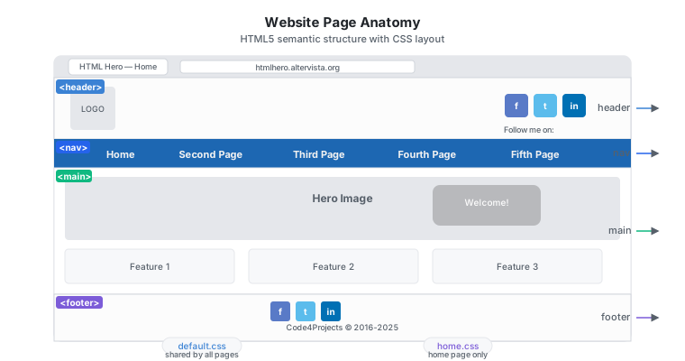
Part 2 starts properly here. The first thing every real website needs is a consistent header and footer on every page.
HTML5 introduced the <header> and <footer> tags specifically for these regions. Using them instead of a generic <div> has two benefits: the code is more readable, and search engines and screen readers understand the structure better.
<body>
<div id="page">
<header>
<div id="header-group">
<div id="logo">
<img src="assets/img/code4projects-logo-mini.webp"
alt="Code4Projects Logo" width="150" height="150">
</div>
</div>
</header>
<main>
<!-- page content here -->
</main>
<footer>
<div id="site-info">
Code4Projects, Copyright Salvatore D'Angelo © 2016-2025.
</div>
</footer>
</div>
</body>
The CSS gives the header a light background and fixes its height. The #header-group container uses Flexbox to position the logo and, in later lessons, the social icons side by side:
header {
    background-color: #FCFCFC;
    width: 100%;
}

#header-group {
    padding: 0px 35px;
    max-width: 1080px;
    margin-left: auto;
    margin-right: auto;
    display: flex;
    flex-direction: row;
    justify-content: space-between;
}
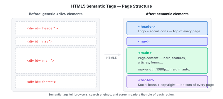
The key takeaway: semantic tags (
<header>,<footer>,<nav>,<main>) are not just cosmetic — they communicate the structure of your page to browsers, search engines, and assistive technologies.
This same header and footer markup is copied to all five HTML files. That repetition is deliberate at this stage: in a real project you would use a template engine or a framework to avoid it, but at the beginner level it is important to understand exactly what is being shared before abstracting it away.
Social Media Icons with Font Awesome
Plain text links for social profiles look dated. The industry standard is to use icon fonts, and Font Awesome is the most widely adopted one.
Font Awesome delivers icons as a web font, which means no image files are needed — each icon is a Unicode character rendered by a font file. The project uses a local copy of Font Awesome to avoid any external dependency. Two CSS files are added to the project:
assets/css/fontawesome.css— core Font Awesome rulesassets/css/brands.css— brand icon definitions (Facebook, Twitter, etc.)
These are linked from every page alongside default.css:
<link rel="stylesheet" type="text/css" href="assets/css/default.css">
<link rel="stylesheet" type="text/css" href="assets/css/brands.css">
<link rel="stylesheet" type="text/css" href="assets/css/fontawesome.css">
Adding a social icon button to the header is then a matter of one <a> tag with the right Font Awesome class:
<a aria-label="Code4Projects Facebook page"
   class="social-media-icon social-media-icon-facebook"
   href="https://www.facebook.com/code4projects/">
    <span class="fa-brands fa-facebook-f"></span>
</a>
The social-media-icon class controls the button size and shape (36×36 px, rounded corners). The social-media-icon-facebook class gives it the characteristic blue gradient background. The fa-brands fa-facebook-f classes on the <span> render the actual icon from the font file.
Completing the Footer
With Font Awesome already integrated, completing the footer is straightforward: reuse the same social icon markup inside <footer> and add the copyright text next to it.
<footer>
<div id="footer-social-media-group">
<div class="social-media-title">Follow me on:</div>
<div class="social-media-icons">
<!-- same icon markup as in the header -->
</div>
</div>
<div id="site-info">
Code4Projects, Copyright Salvatore D'Angelo © 2016-2025.
</div>
</footer>
The CSS uses Flexbox to stack the social area above the copyright text and keep everything centred. The important point here is code reuse: once you understand a pattern (icon button with Font Awesome), you apply it in multiple places without reinventing it.
The Navigation Bar
Every multi-page site needs a way to move between pages. A navigation bar is the standard solution, and HTML already has a semantic element for it: <nav>.
The markup uses an unordered list inside <nav>. At this point the links still point to the five original pages by filename:
<div id="navigation">
    <nav>
        <ul>
            <li><a href="index.html">Home</a></li>
            <li><a href="second_page.html">Second Page</a></li>
            <li><a href="third_page.html">Third Page</a></li>
            <li><a href="fourth_page.html">Fourth Page</a></li>
            <li><a href="fifth_page.html">Fifth Page</a></li>
        </ul>
    </nav>
</div>
By default an unordered list is vertical. CSS transforms it into a horizontal blue bar:
#navigation {
    background-color: #1D67B2;
}

nav {
    padding: 5px;
    max-width: 1080px;
    margin-left: auto;
    margin-right: auto;
}

nav ul li {
    padding: 11px 35px;
    display: inline-block;
}

nav ul li a {
    color: #f2f2f2;
    text-decoration: none;
    font-weight: 700;
}
display: inline-block is the key rule: it tells each <li> to sit side by side instead of stacking. The #navigation div gets the blue background, and the link colour is set to near-white so it is readable against that background.
Building the Home Page
Inner pages (the five content pages) all share the same basic structure. The home page is different: it needs a visual impact — a hero image, sections with icons, and featured content. This is why a second CSS file, home.css, is introduced and loaded only by index.html.
The Hero Area
The hero area fills the full width with a background image and overlays a text box on top of it:
.hero-background {
    background-image: url("../../assets/img/code4projects-image-hero.webp");
    background-position: center;
    background-repeat: no-repeat;
    background-size: cover;
    position: relative;
}

.hero-box {
    padding: 50px 40px;
    display: flex;
    flex-direction: row;
    justify-content: flex-end;
}

.hero-messagebox {
    padding: 50px 40px;
    max-width: 400px;
    background-color: RGBA(139, 139, 139, 0.5);
    border-radius: 20px;
}
background-size: cover scales the image to fill the entire element without distortion. justify-content: flex-end pushes the text box to the right side. The semi-transparent grey background (RGBA with 0.5 alpha) makes the text legible over any background image.
The Newsletter Section
A newsletter sign-up section sits below the feature rows. It uses Flexbox to place an eBook cover image and the sign-up form side by side:
<div class="newsletter-home-box">
    <div class="newsletter-home-image">
        <img src="assets/img/3D-DockerCover-medium.png"
             alt="Join our Newsletter and Download a Free eBook">
    </div>
    <div class="newsletter-home-form">
        <div class="newsletter-home-text-title">Download Free eBook</div>
        <form action="#" method="get" target="_blank">
            <input class="newsletter-home-input" name="name"
                   type="text" placeholder="Name" required>
            <input class="newsletter-home-input" name="email"
                   type="email" placeholder="Email" required>
            <button type="submit" class="primary">Download</button>
        </form>
    </div>
</div>
The type="email" attribute on the email field gives you basic format validation for free — the browser will reject submissions that do not look like an email address, without any JavaScript needed.
Making the Site Responsive
A site that works on desktop but breaks on a phone is not a finished site. The final step of Part 2 adds responsive design, which means the layout adapts automatically to the screen size.
The Viewport Meta Tag
The first change is the simplest: add this <meta> tag to the <head> of every page.
<meta name="viewport" content="width=device-width, initial-scale=1">
Without it, mobile browsers scale the page down to fit, rendering it as a shrunken desktop version. With it, the browser uses the actual device width and the layout rules you define via media queries.
Media Queries
The project targets four breakpoints. The diagram below shows how the layout changes at each one:
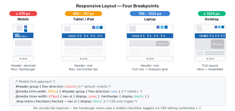
The project targets four breakpoints:
| Name | Width range |
|---|---|
| Mobile phones | ≤ 479 px |
| Tablets / iPad | 480 px – 767 px |
| Laptop / small screen | 768 px – 1023 px |
| Desktop | ≥ 1024 px |
The CSS follows a mobile-first approach: the default rules are written for mobile, then overridden for wider screens using @media screen and (min-width: ...). For example, the header layout is vertical by default and switches to horizontal row on tablets and above:
/* Default: mobile — vertical stack */
#header-group {
    display: flex;
    flex-direction: column;
    justify-content: center;
}

/* Tablets and wider: horizontal row */
@media screen and (min-width: 480px) {
    #header-group {
        flex-direction: row;
        justify-content: space-between;
    }
}
The Hamburger Menu
On a phone, a horizontal navigation bar does not fit. The solution is a hamburger menu: three horizontal lines that, when tapped, reveal the navigation links in a dropdown.
The implementation uses a hidden checkbox as a CSS-only toggle — no JavaScript required:
<div id="navigation">
    <input class="drop-menu-checkbox" type="checkbox" id="drop-menu-checkbox">
    <label class="hamburger" for="drop-menu-checkbox">
        <span class="hamburger-line"></span>
    </label>
    <nav>
        <ul>
            <li><a href="index.html">Home</a></li>
            <!-- ... -->
        </ul>
    </nav>
</div>
The three hamburger lines are drawn entirely in CSS using ::before and ::after pseudo-elements on .hamburger-line. When the checkbox is checked, a CSS rule makes the <ul> visible:
/* Mobile: nav list hidden by default */
@media screen and (max-width: 479px) {
    nav ul {
        display: none;
    }
}

/* Show nav when checkbox is checked */
.drop-menu-checkbox:checked ~ nav ul {
    display: block;
}

/* Hide hamburger on screens wider than mobile */
@media screen and (min-width: 480px) {
    .hamburger {
        display: none;
    }
}
The ~ is the CSS general sibling combinator: it selects nav ul when .drop-menu-checkbox (the hidden checkbox) is a preceding sibling. Clicking the hamburger label toggles the checkbox, which toggles the menu — no JavaScript at all.
The Final File Structure
After all Part 2 lessons, the project structure looks like this:
lesson-19/
├── index.html
├── second_page.html
├── third_page.html
├── fourth_page.html
├── fifth_page.html
├── favicon.ico
└── assets/
    ├── css/
    │   ├── default.css       ← shared by all pages
    │   ├── home.css          ← home page only
    │   ├── fontawesome.css   ← Font Awesome core
    │   └── brands.css        ← Font Awesome brand icons
    ├── fontawesome/
    │   └── webfonts/         ← .ttf and .woff2 font files
    └── img/                  ← site images
The separation between default.css (shared rules) and home.css (home-page-only rules) is the key architectural decision. It keeps the shared stylesheet focused and makes it clear what is specific to the home page.
Conclusion
In this article we covered:
- How to use
<header>and<footer>semantic tags for a consistent page structure - How to integrate Font Awesome locally to add scalable social media icons
- How to build a horizontal navigation bar from a
<ul>withdisplay: inline-block - How to structure a home page with a CSS background image hero, circular icons, and feature sections
- How to add a newsletter sign-up form with styled
<input>fields - How to apply responsive design with the viewport meta tag, media queries, and a CSS-only hamburger menu
The next article builds out the real content pages: About Me, Start Here, Resources, a Contacts form, and an interactive photo gallery — introducing HTML forms, CSS Grid, and the first JavaScript in the series.