Building the Complete Website: Real Pages, HTML Forms, and a Photo Gallery

Introduction
In the previous article you gave your site a real shell: a consistent header and footer, a navigation bar, social media icons, a styled home page, and a responsive hamburger menu. The five inner pages still had placeholder content — just a heading and a paragraph.
This is Part 4 of the series. If you missed the earlier articles, you can start from Getting Started with HTML, Mastering the Basics of CSS, or Building a Professional Website Layout with CSS.
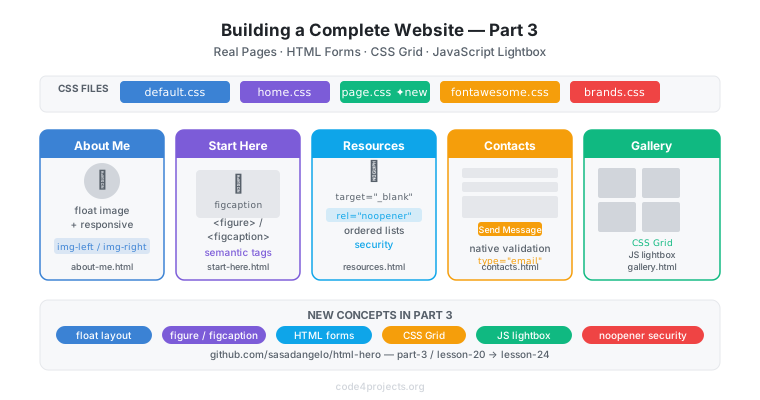
This article builds out those pages for real. Following the Part 3 of the html-hero project lesson by lesson, I will show you how to write the About Me, Start Here, and Resources pages, how to build a contact form with HTML form elements, and how to create an interactive photo gallery using CSS Grid and a handful of lines of JavaScript.
You should read this article if:
- you completed Part 3 and want to move beyond layout into real content pages
- you have never built an HTML form and want to understand how
<input>,<label>,<textarea>, and<button>work together - you want to understand CSS Grid and how it differs from Flexbox for image-based layouts
- you want to add your first JavaScript to a web page without reaching for a framework
All the source code is available in the part-3 folder of the html-hero repository. Each lesson has its own subfolder (lesson-20 through lesson-24) so you can compare the result at every step.
A New CSS File: page.css
Part 2 used two CSS files: default.css (shared by every page) and home.css (home page only). Part 3 introduces a third file, page.css, loaded by all inner pages.
The separation is deliberate. The home page has a hero image, feature rows, and a newsletter section — styles that make no sense on an article page. Inner pages share a different set of needs: a centred content container, floating images, styled blockquotes, form fields, and gallery cells.
<link rel="stylesheet" type="text/css" href="assets/css/default.css">
<link rel="stylesheet" type="text/css" href="assets/css/page.css">
<link rel="stylesheet" type="text/css" href="assets/css/brands.css">
<link rel="stylesheet" type="text/css" href="assets/css/fontawesome.css">
The base rules in page.css centre the content area and handle text and image layout:
#page-container {
    max-width: 1080px;
    margin-left: auto;
    margin-right: auto;
    padding: 10px;
    overflow: hidden;
}

p {
    color: #666666;
    text-align: justify;
}

img.img-left {
    float: left;
    padding: 10px 10px 10px 0px;
}

img.img-right {
    float: right;
    padding: 10px 0px 10px 10px;
}
The overflow: hidden on #page-container is a classic float-clearing trick: it forces the container to expand around any floated images inside it, preventing them from overflowing outside the box.
The About Me Page
The About Me page is the simplest of the five — it follows the same article-style structure as any inner page: a heading, paragraphs of text, and images floated left or right to break the visual monotony.
<main class="page-main">
    <div id="page-container">
        <h1>About Me</h1>
        <img class="img-left" src="assets/img/salvatore_d_angelo.jpeg"
             alt="Salvatore D'Angelo" width="150" height="150">
        <p>
            My name is Salvatore D'Angelo and I am a professional software engineer ...
        </p>
    </div>
</main>
The img-left class floats the profile picture to the left so the text wraps around it on wider screens. On mobile (below 480 px) the float is removed and the image sits above the paragraph, which reads more naturally on a narrow screen:
/* Mobile: no float, image sits above text */
img.img-left {
    padding: 10px;
}

/* Tablets and wider: float left */
@media screen and (min-width: 480px) {
    img.img-left {
        float: left;
        padding: 10px 10px 10px 0px;
    }
}
The
floatproperty was the original CSS layout mechanism before Flexbox and Grid existed. It is still the right tool when you want text to wrap around an image.
The Start Here Page and <figure>
The Start Here page introduces two semantic HTML elements you have not seen yet: <figure> and <figcaption>.
A <figure> groups an image with its caption as a single semantic unit. Search engines and screen readers understand that the caption belongs to the image — something a plain <img> followed by a <p> does not communicate:
<figure>
    <img class="responsive_img"
         src="assets/img/software-developer2.jpg"
         alt="Software Developer">
    <figcaption>
        Photo from
        <a href="https://clipartstation.com/">clipartstation.com</a>
    </figcaption>
</figure>
The CSS in page.css handles the caption and link styling:
figure {
    margin: 0px;
}

figure figcaption a {
    color: #1D67B2;
}
The margin: 0 overrides the browser default margin on <figure> (some browsers add 40 px of horizontal margin by default), which would otherwise push the figure away from the page edges unexpectedly.
The Resources Page
The Resources page is a curated list of links. It uses <ol> for ordered lists and demonstrates the target="_blank" attribute, which opens links in a new tab:
<a href="https://developer.mozilla.org/en-US/"
   target="_blank" rel="noopener noreferrer">
    MDN Web Docs
</a>
The rel="noopener noreferrer" attribute is not optional when using target="_blank". Without it, the opened page can access the opener’s window object via window.opener — a security vulnerability known as reverse tabnapping. Always pair target="_blank" with rel="noopener noreferrer".
The CSS rule list-style-position: inside keeps the list numbers visually aligned within the content container rather than hanging outside it:
ol {
    list-style-position: inside;
}
The Contacts Page and HTML Forms
A contact form lets visitors send messages directly through the website. HTML provides all the elements needed — no JavaScript required for the structure.
The <form> tag is the container. Its two most important attributes are action (where to send the data) and method (how to send it). In this project action is empty because there is no backend server:
<form onsubmit="return false">

    <label for="name">Name:</label>
    <input type="text" id="name" name="name"
           placeholder="Your name" required>

    <label for="email">Email:</label>
    <input type="email" id="email" name="email"
           placeholder="Your email" required>

    <label for="message">Message:</label>
    <textarea id="message" name="message" rows="8"
              placeholder="Write your message here..."></textarea>

    <button type="submit">Send Message</button>

</form>
The key elements and their roles:
| Element | Purpose |
|---|---|
<label> |
Associates a visible description with a field; clicking the label focuses the field |
<input type="text"> |
Single-line text field |
<input type="email"> |
Email field — browser validates the format automatically |
<textarea> |
Multi-line text field |
<button type="submit"> |
Submits the form |
The for attribute on <label> must match the id attribute on the associated field. This pairing is essential for accessibility: screen readers announce the label when the field receives focus, and clicking the label moves focus to the field.
The required attribute activates browser-native validation — the form cannot be submitted if the field is empty, without a single line of JavaScript.
type="email"is a free input validator: the browser rejects values that do not contain an@sign and a domain. It is not a substitute for server-side validation, but it catches obvious mistakes immediately.
The form elements are styled in page.css to match the overall site look:
form label {
    display: block;
    margin-top: 10px;
    font-weight: bold;
    color: #444444;
}

form input,
form textarea {
    width: 100%;
    padding: 8px;
    border: 1px solid #cccccc;
    border-radius: 4px;
    box-sizing: border-box;
}

form button {
    margin-top: 12px;
    padding: 10px 24px;
    background-color: #1D67B2;
    color: #ffffff;
    border: none;
    border-radius: 4px;
    cursor: pointer;
    font-weight: bold;
}
box-sizing: border-box is important: without it, width: 100% plus padding would make the field wider than its container. With border-box, the padding is included in the declared width, so the field stays within bounds.
The Gallery Page: CSS Grid and JavaScript
The gallery is the most technically interesting page in Part 3. It introduces two things: CSS Grid for the image grid layout, and a small JavaScript file for the lightbox viewer.
CSS Grid for the Image Grid
Flexbox is ideal for one-dimensional layouts — a row of icons, a column of cards. CSS Grid is designed for two dimensions: rows and columns simultaneously. A photo gallery is the perfect use case.
.gallery-grid {
    display: grid;
    grid-template-columns: repeat(auto-fill, minmax(150px, 1fr));
    gap: 10px;
    margin-top: 20px;
}
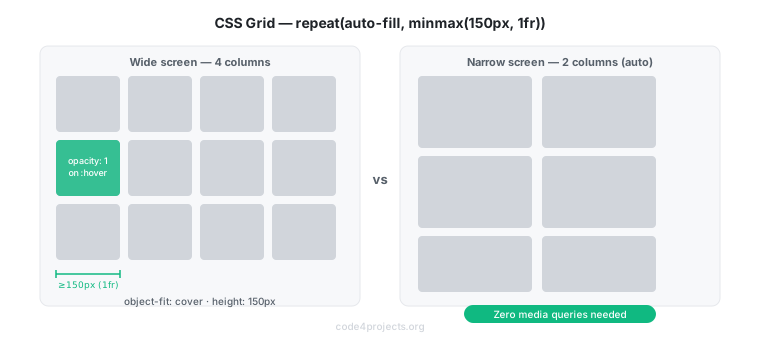
The repeat(auto-fill, minmax(150px, 1fr)) value is the key. Breaking it down:
auto-fill— create as many columns as fit in the available widthminmax(150px, 1fr)— each column is at least 150 px wide and at most one equal fraction of the available space
The result is a fully responsive grid: on a wide screen you get many columns; on a phone you might get two or three — with zero media queries.
Each cell clips the image to a fixed height:
.gallery-cell img {
    width: 100%;
    height: 150px;
    object-fit: cover;
    cursor: pointer;
    opacity: 0.85;
    transition: opacity 0.2s ease;
}

.gallery-cell img:hover {
    opacity: 1;
}
object-fit: cover scales the image to fill its cell without distortion, cropping the edges if necessary — the same behaviour as background-size: cover for background images.
The JavaScript Lightbox
When a user clicks a thumbnail, a full-screen viewer opens. This requires JavaScript because it involves responding to a user event and changing the DOM.
The script is kept in a separate file, assets/js/gallery.js, and loaded with the defer attribute:
<script type="text/javascript" src="assets/js/gallery.js" defer></script>
The defer attribute tells the browser to download the script in parallel with the HTML, but execute it only after the DOM is fully parsed. This prevents the classic error where a script tries to access an element that has not been created yet.
The gallery HTML uses an onclick attribute to call the JavaScript function:
<div class="gallery-cell">
    <img src="assets/gallery/photo1.jpg"
         alt="Photo 1"
         onclick="showImage(this)">
</div>
The viewer is a hidden <div> that becomes visible when an image is clicked:
<div id="gallery-viewer">
<span id="gallery-close" onclick="closeImage()">×</span>
<img id="gallery-expanded-img" src="" alt="">
</div>
The JavaScript is minimal — two functions:
function showImage(img) {
    var viewer = document.getElementById("gallery-viewer");
    var expandedImg = document.getElementById("gallery-expanded-img");
    expandedImg.src = img.src;
    expandedImg.alt = img.alt;
    viewer.style.display = "block";
}

function closeImage() {
    document.getElementById("gallery-viewer").style.display = "none";
}
showImage copies the src and alt from the clicked thumbnail into the expanded image, then makes the viewer visible by setting style.display = "block". closeImage hides it again by setting display = "none".
The viewer is styled as a fixed full-screen overlay:
#gallery-viewer {
    display: none;
    position: fixed;
    top: 0;
    left: 0;
    width: 100%;
    height: 100%;
    background-color: rgba(0, 0, 0, 0.9);
    z-index: 100;
    text-align: center;
    padding-top: 50px;
    box-sizing: border-box;
}
position: fixed positions the viewer relative to the viewport, not the page — it stays in place even when the user scrolls. z-index: 100 places it above everything else on the page.
The Final File Structure
After all Part 3 lessons, the project has grown from a layout shell to a complete multi-page site:
lesson-24/
├── index.html
├── about-me.html
├── start-here.html
├── resources.html
├── contacts.html
├── gallery.html
└── assets/
    ├── css/
    │   ├── default.css       ← shared by all pages
    │   ├── home.css          ← home page only
    │   ├── page.css          ← inner pages, form, gallery
    │   ├── fontawesome.css   ← Font Awesome core
    │   └── brands.css        ← Font Awesome brand icons
    ├── fontawesome/
    │   └── webfonts/         ← .ttf and .woff2 font files
    ├── img/                  ← site images
    ├── gallery/              ← gallery photos
    └── js/
        └── gallery.js        ← gallery lightbox
The three-CSS-file architecture (default.css, home.css, page.css) keeps each stylesheet focused: shared structure, home-page layout, and inner-page content styles never mix. Adding a new page type in the future means adding a new CSS file, not modifying an existing one.
Conclusion
In this article we covered:
- How to introduce
page.cssto separate inner-page styles from home-page styles - How to use floated images on article pages and remove the float on mobile with media queries
- How
<figure>and<figcaption>communicate image-caption relationships to browsers and assistive technologies - How
target="_blank"combined withrel="noopener noreferrer"safely opens links in new tabs - How to build a contact form with
<input>,<label>,<textarea>, and<button>, and how browser-native validation works - How CSS Grid with
repeat(auto-fill, minmax(...))creates a fully responsive photo grid without media queries - How to write a JavaScript lightbox in two functions and load it with
defer
The series has now covered the full beginner path: from a blank HTML file to a complete, responsive, multi-page website with a form and an interactive gallery. This is the final article in the series.
If you enjoyed this article, don’t forget to give it a clap 👏, share it with your friends 🔗, and follow me for more tips and tutorials on software development 📘. Your support helps me create more content like this — thank you! 🙌
Note: English is not my native language, and this article was drafted with the assistance of AI. However, all the ideas, projects, concepts, and content are entirely my own.